
Explore brand refresh
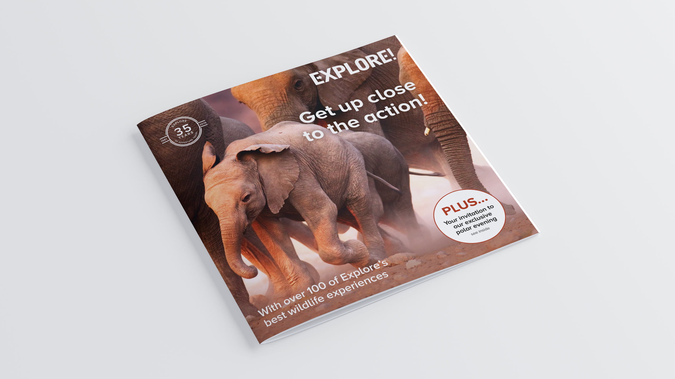
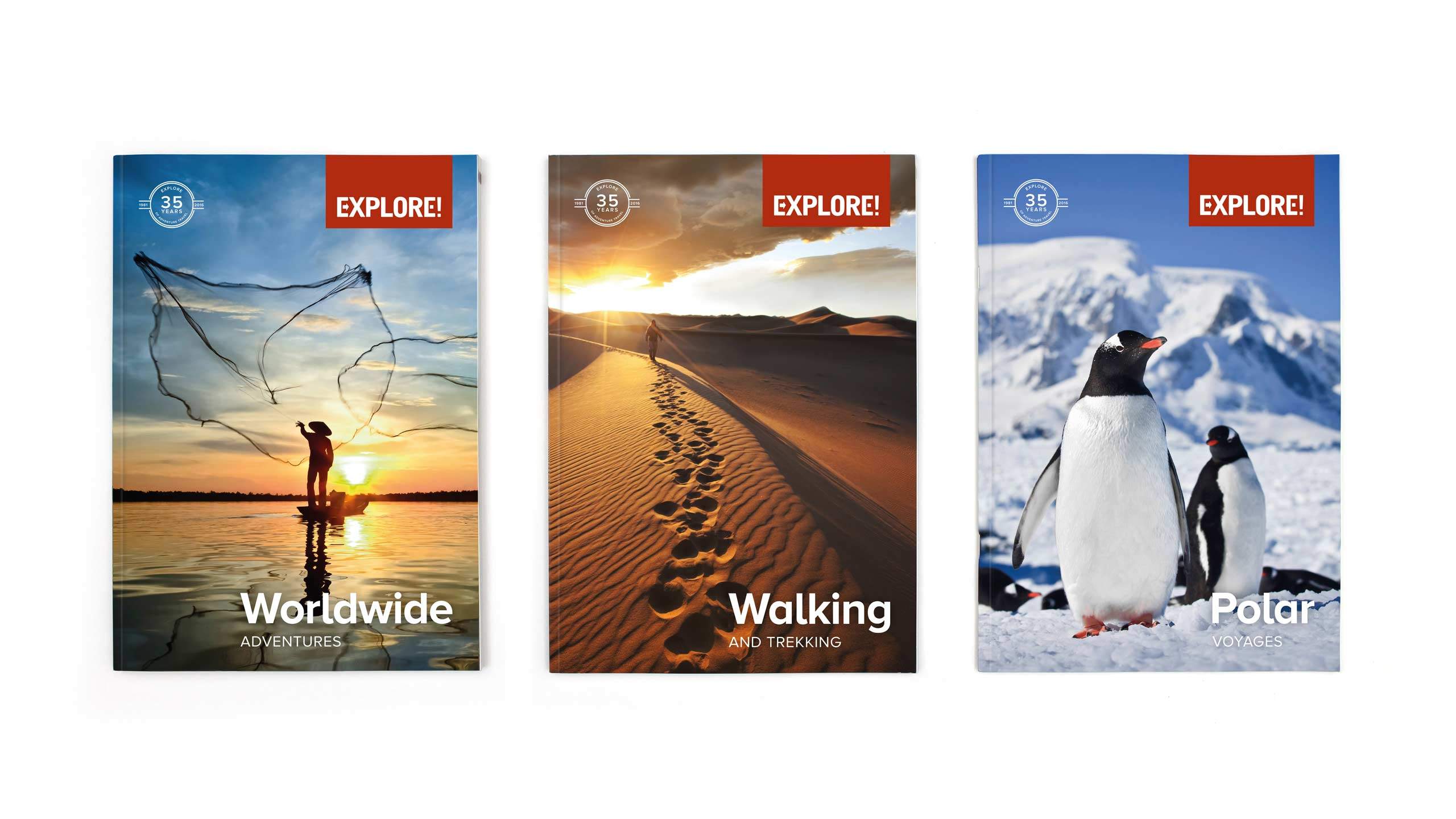
Having previously redesigned the branding for Explore and to celebrate Explore Worldwide providing 35 years of adventures. It was time to refresh their branding and Whitehot were asked to create a new look for them that would run across all of their marketing material.
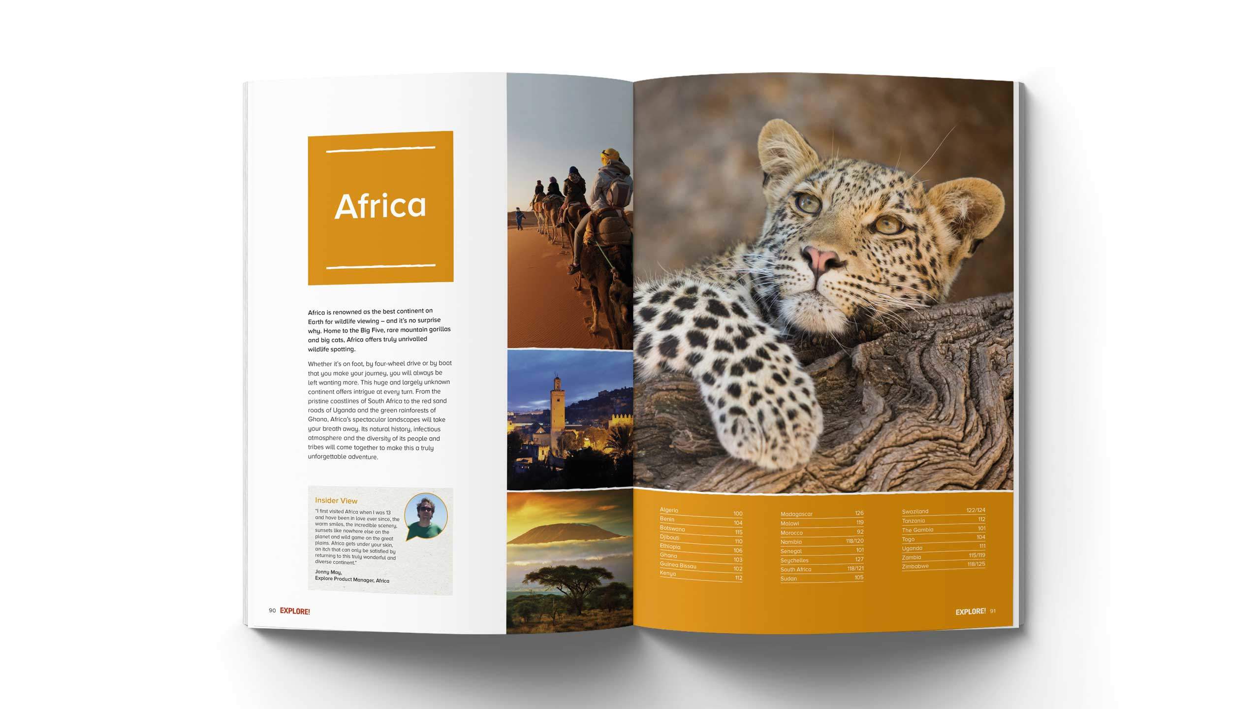
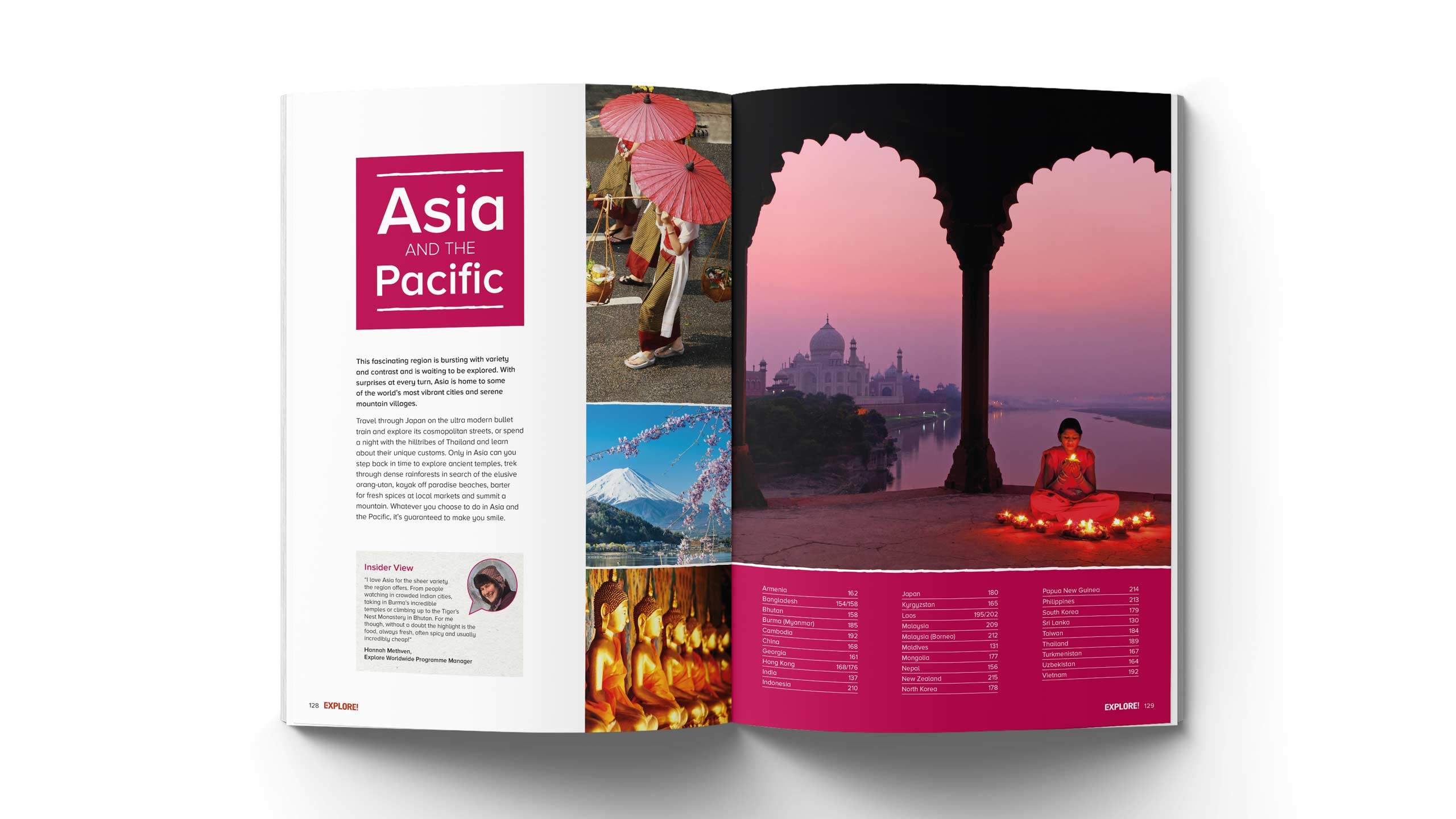
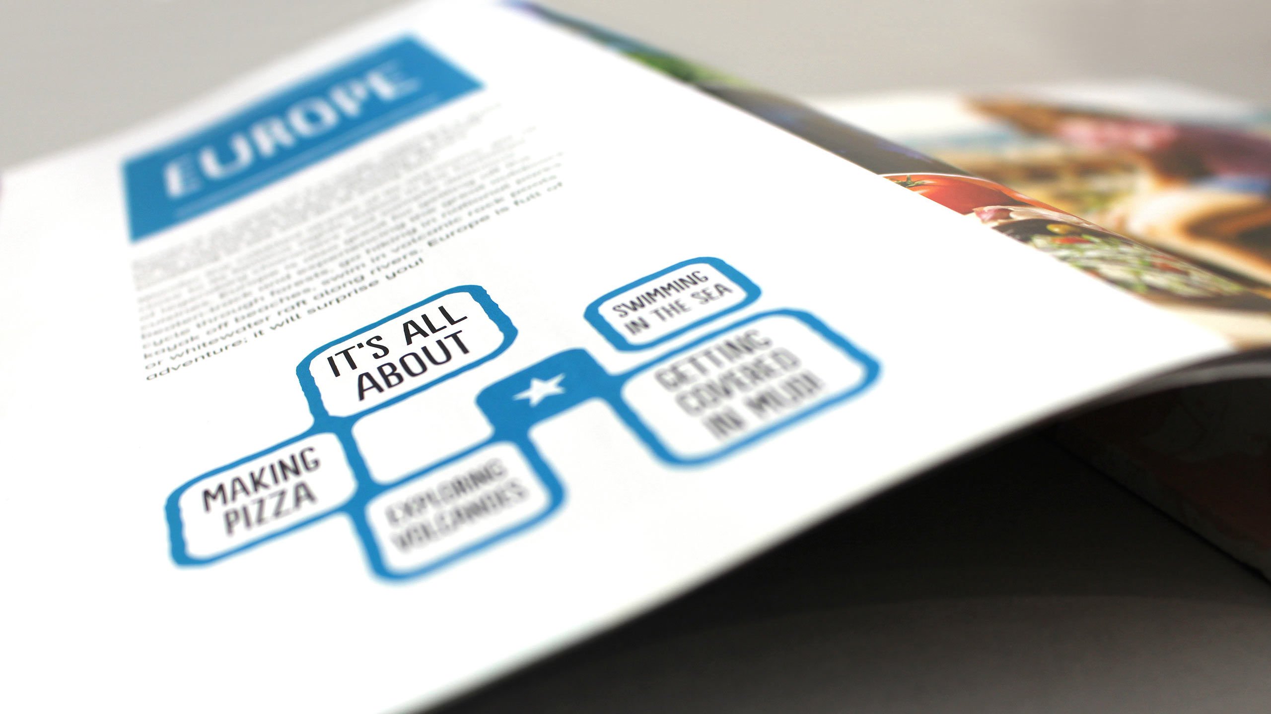
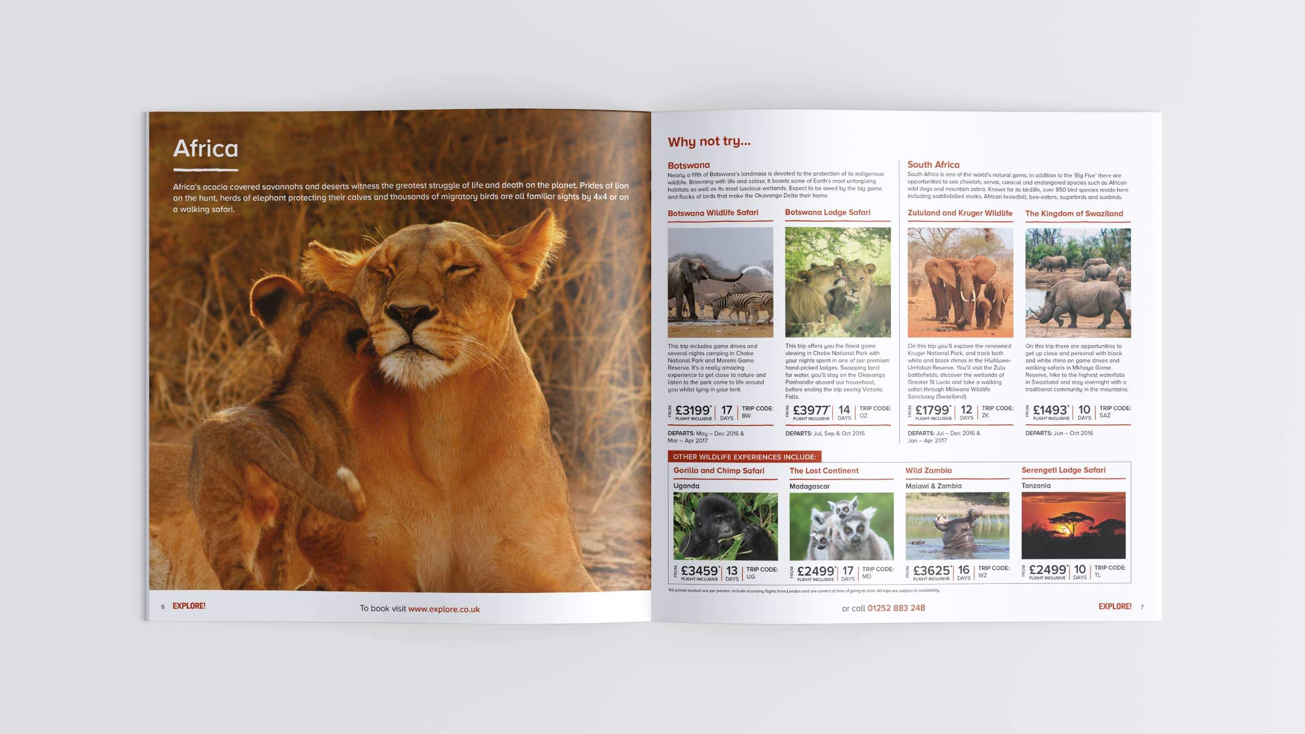
Our team rose to the challenge by refreshing the brand with a clean modern design, inspirational imagery and bold contemporary sans serif typography. We retained the essence of the Explore adventure spirit and the authenticity of their trips by still embracing a little bit of the rugged texture found in the original design.
Working with Lisa and the team is always a pleasure. Having worked with them on various creative projects including the production of our annual brochure portfolio, I have always found their helpful and supportive approach second to none and would highly recommend them.
Vicki Wren, Brand Marketing Manager, Explore Worldwide
On time and on budget
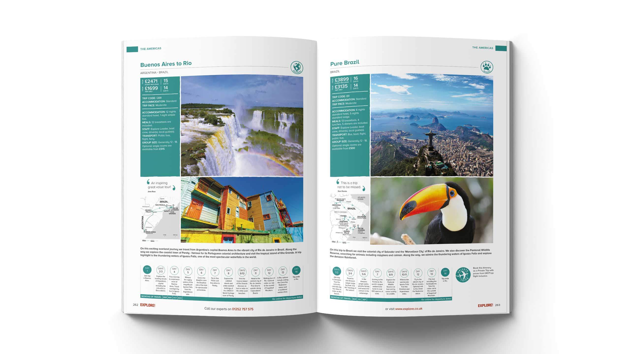
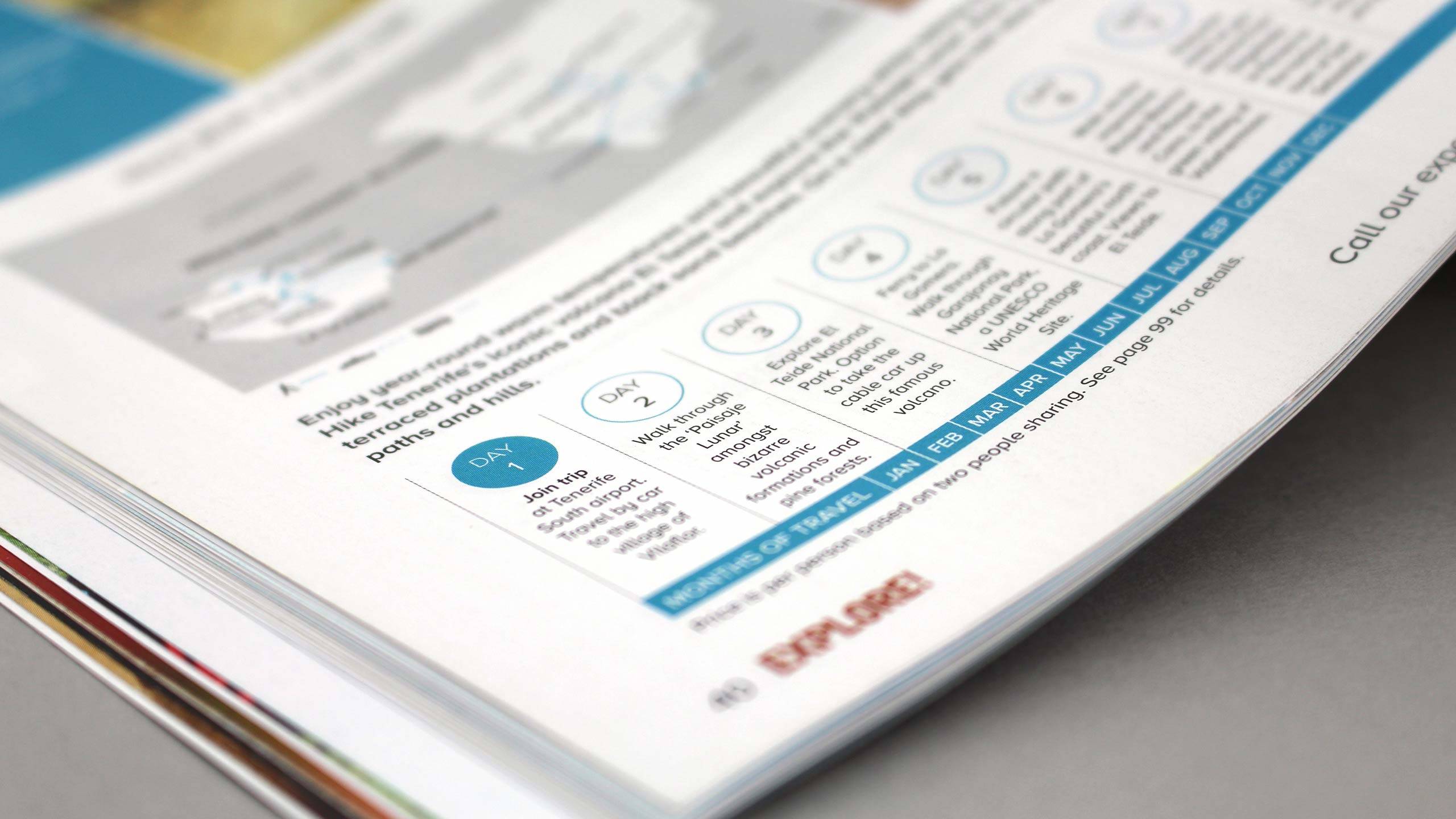
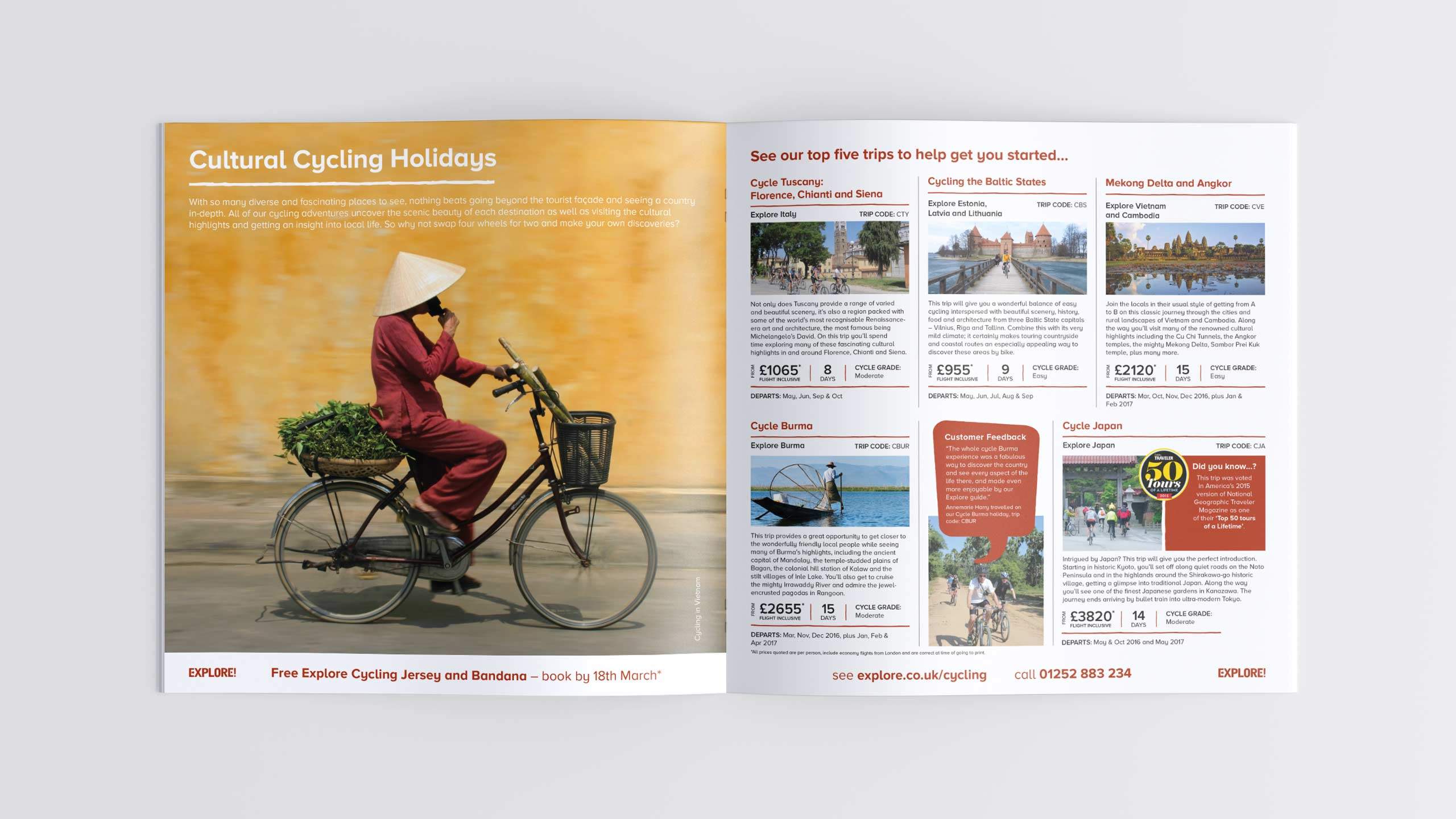
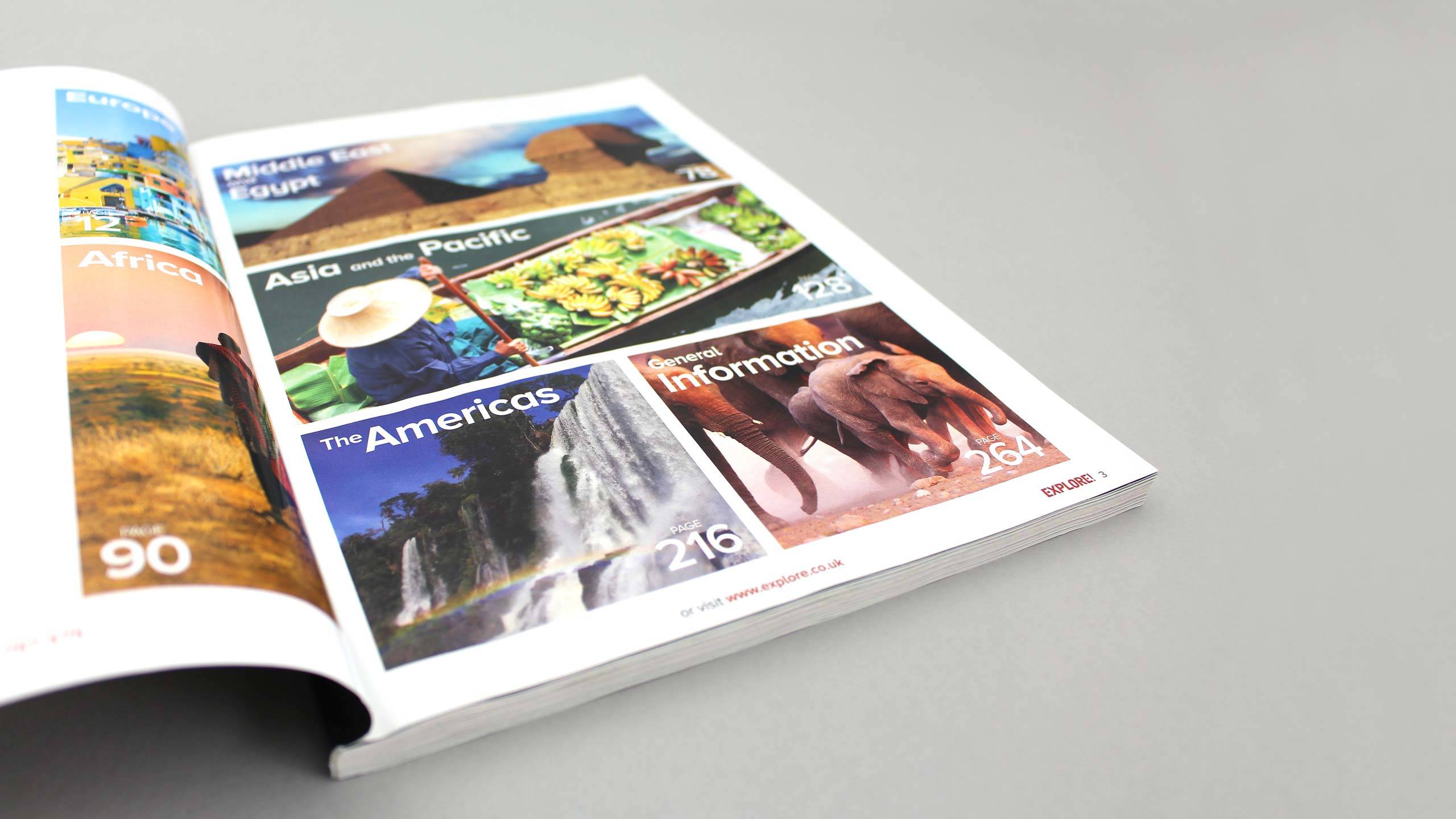
Our team then went on to simultaneously designed and produced Explore’s annual brochure portfolio – on time and on budget. Our key design improvements included simplifying the pages and streamlining content, which also involved a complete re-design of the itinerary format. Our team also produced all of the maps for use within the brochures and online.
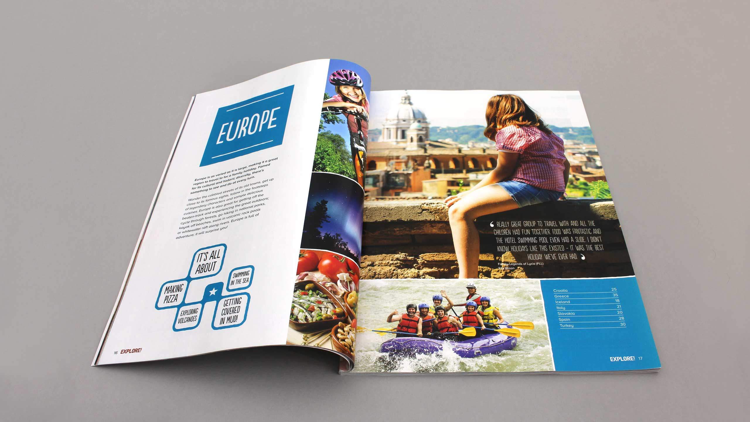
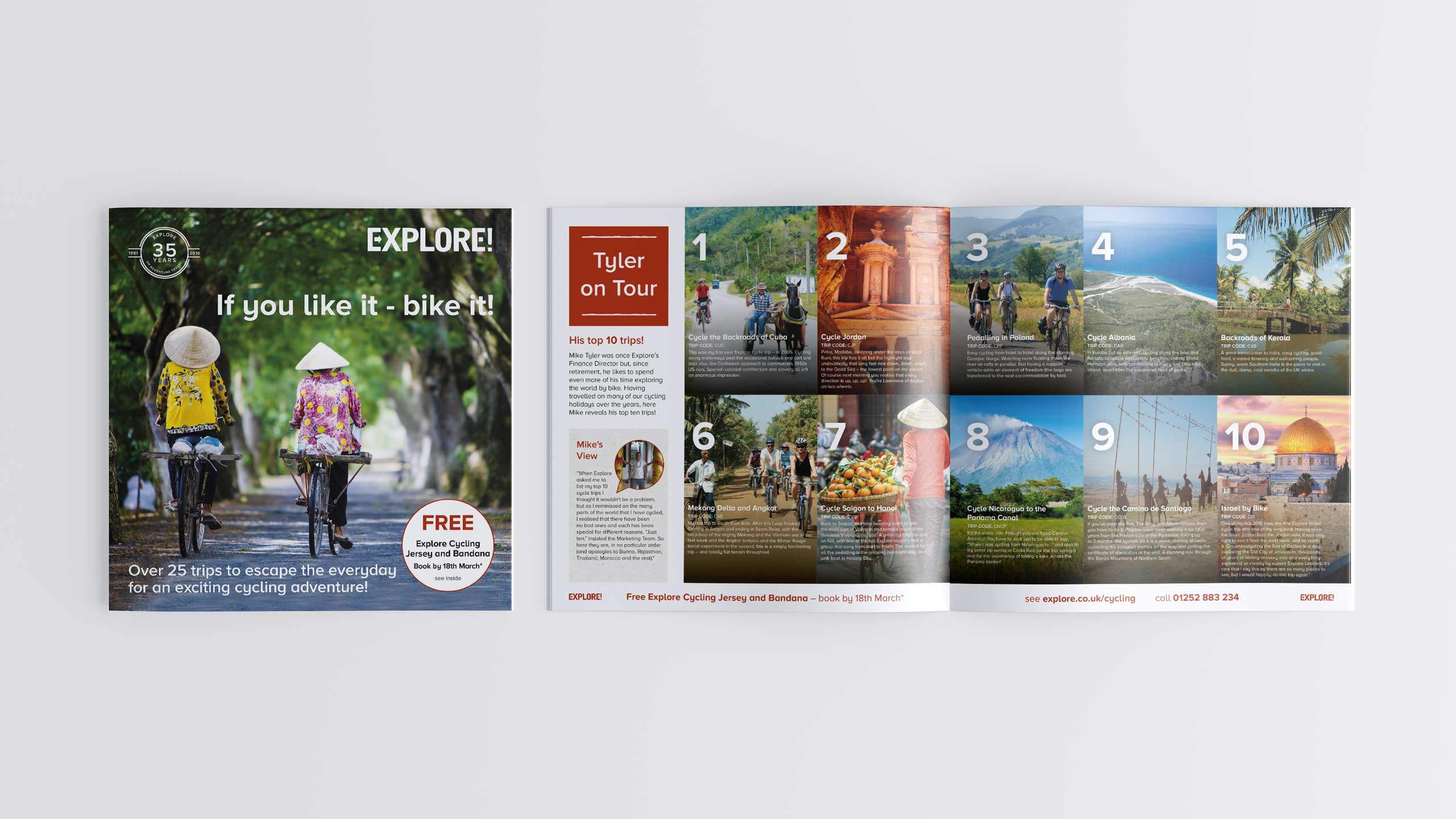
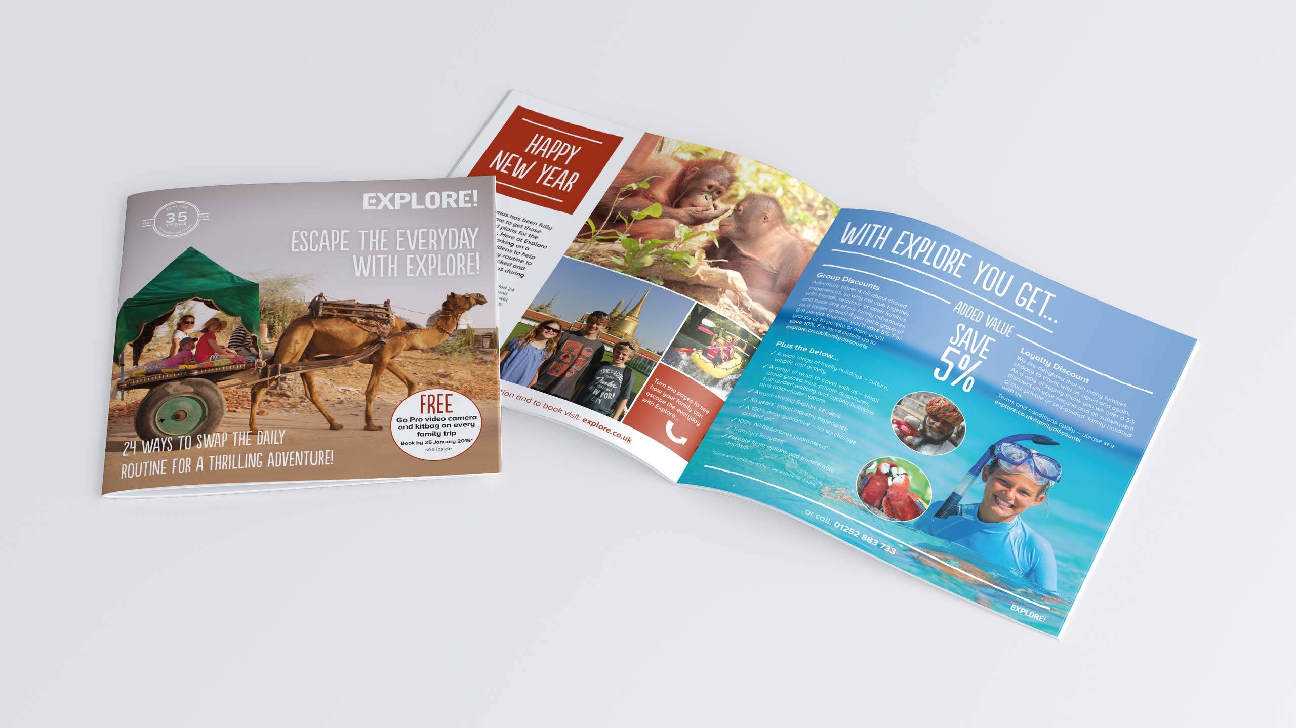
Each brochure focuses on the different travel options that Explore Worldwide offers, all following the same design style, except for the family sub brand which uses subtly different design elements to give a more fun and family feel.
- 276 page Discovery brochure
- 136 page Walking brochure
- 100 page Cycling brochure
- 108 page Family adventures
- 68 page Polar voyages brochure
Other marketing material…
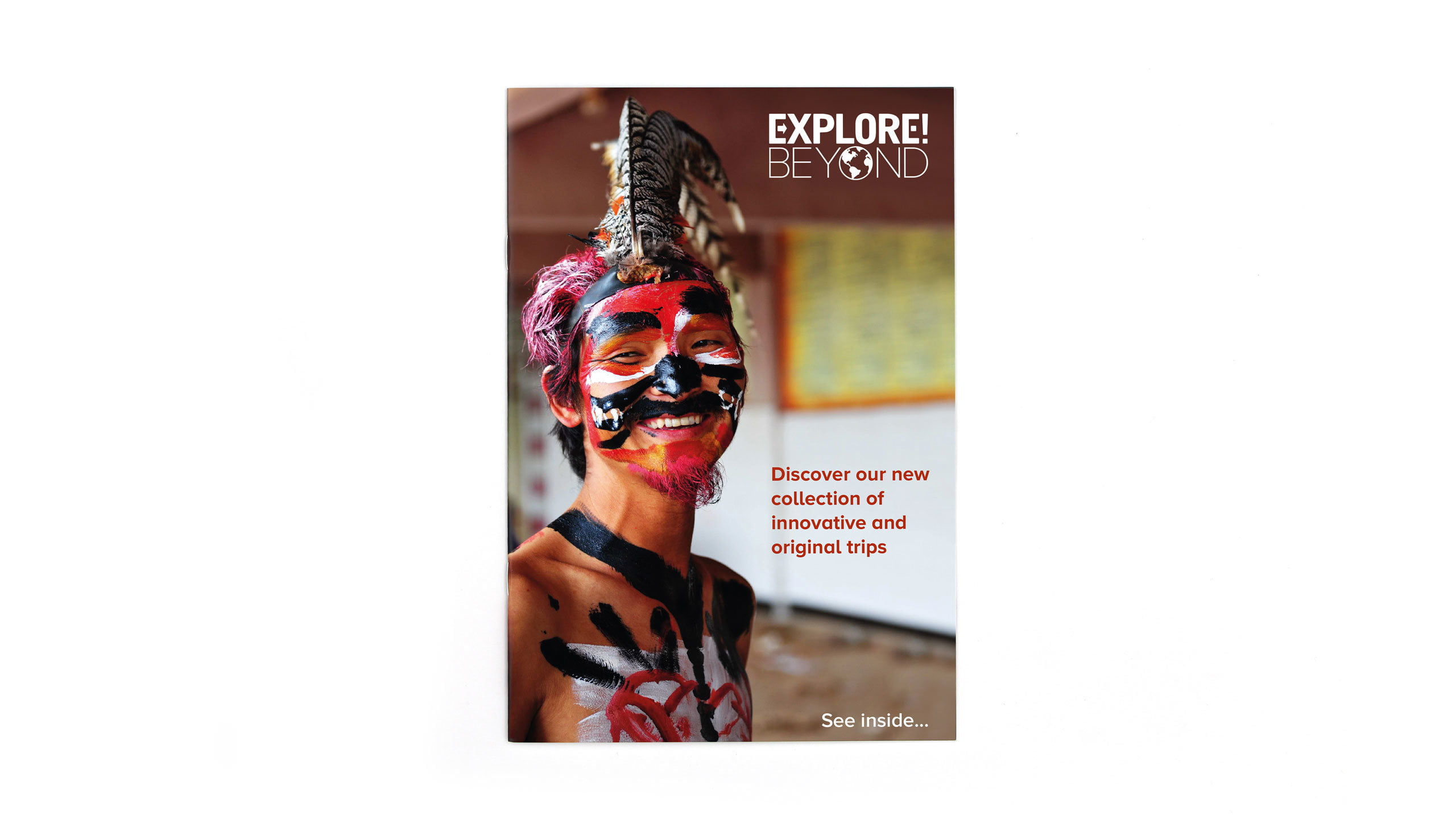
We also produced a comprehensive brand guideline document as well as a full brand toolkit. A set of online and print advertising, some exhibition graphics and a series of direct marketing campaigns all sharing the new look and feel.

