Logo design…
Creating the face of your brand
Chances are, if you’re reading this you need a logo
We’re Whitehot, a Hertfordshire based design agency that’s been helping companies build their brands since 2004. And when it comes to logo design we like to think we know our stuff.
Explore Worldwide, OMG campaign & logo design

The Nobel School logo design, branding & website design
MS Society Awards logo design & branding

Tailormade logo design, branding & travel brochure

Red Sea Holidays logo design, branding, brochures & marketing

Edge Adventure logo design, branding & brochure
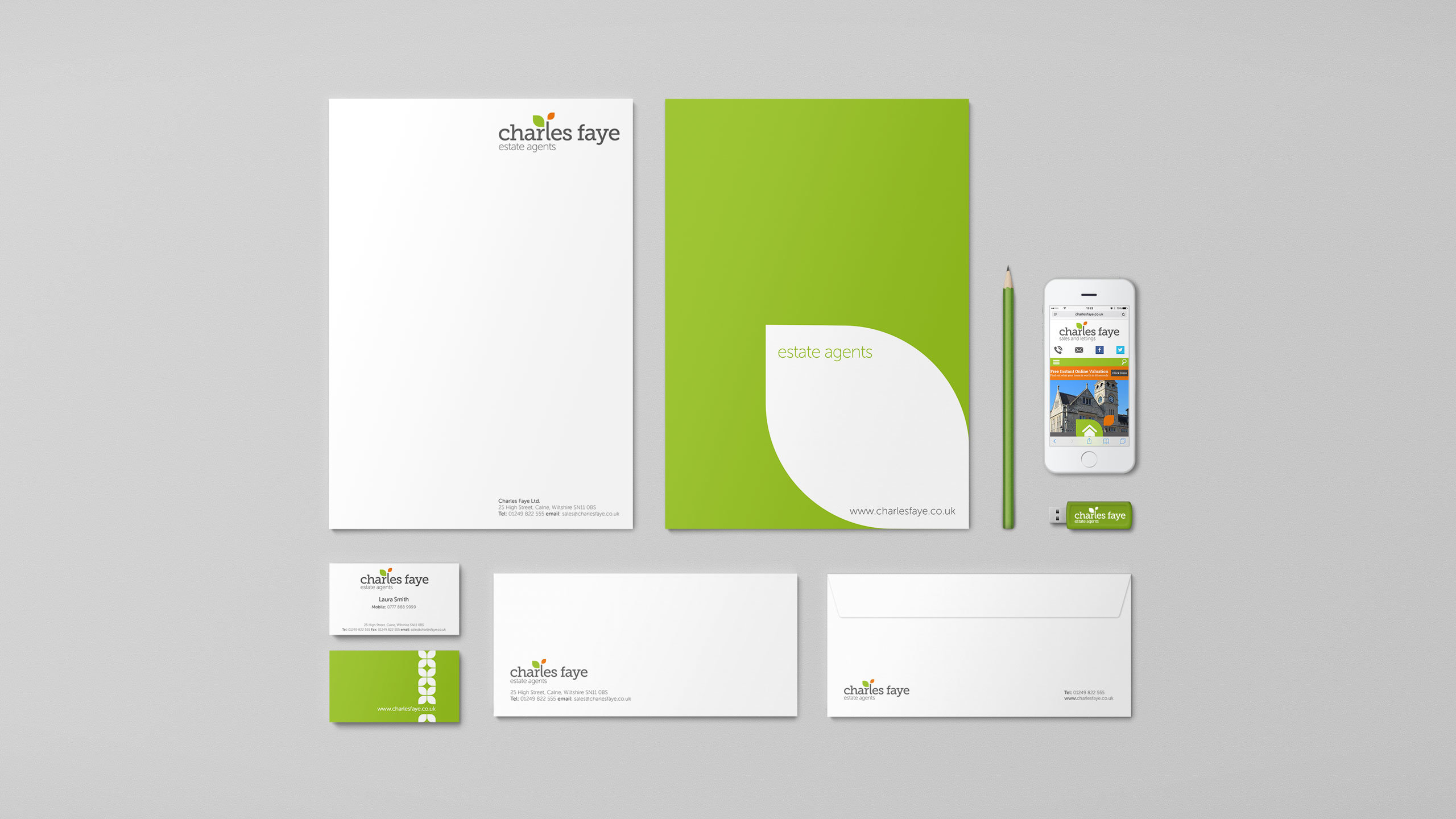
Charles Faye logo design & branding
Brand new thinking™
You may also be interested in branding. Learn more…
Here’s a guide to help you avoid some of the common logo design pitfalls
We’ve put this together to help you decide what you really want from your logo based on the experience we’ve gained over the years. It’s for anyone whose considering getting a new logo and wants to get it right first time but isn’t quite sure where to start. If you already have a logo you can also use this as a health check to see how your existing logo performs.
We’d love to work with you to create your new logo… If after reading this guide you feel the same way, please get in touch using the enquiry form at the bottom of this page.

How does your logo relate to your brand?
The best way to understand how your logo relates to the rest of your brand is to think of your brand as a person. In the same way you can quickly identify a person just by seeing their face in a passport photo. You can quickly identify a brand just by seeing its logo.
The way your brand looks in general (also known as your brand identity) is made up from lots of things including colour palette, imagery, typography and of course your logo, which holds special importance at the top of your brand identity hierarchy. So you can see… Thinking of your logo as the face of your brand is a nice way to understand how the two relate to one another.
What form might your logo take?
Logos are typically typography based, symbol based, or a combination of the two. We’re seeing an increasing trend for clients asking to include an icon within their logo. This gives them the added bonus of a standalone brand element for use in things like apps and browser bookmarks.

Logo design and your brand strategy
Will the logo you’ve designed today still be relevant to your business in the future? Take this simple example. It might make perfect sense for a business that delivers flowers to incorporate a flower in its logo. But what if the business strategy is to include other non-flower products to their delivery offering in the next 2 to 3 years? That flower in the logo won’t seem such a good idea. Opting for a more generic icon would be a better solution.
Black and white
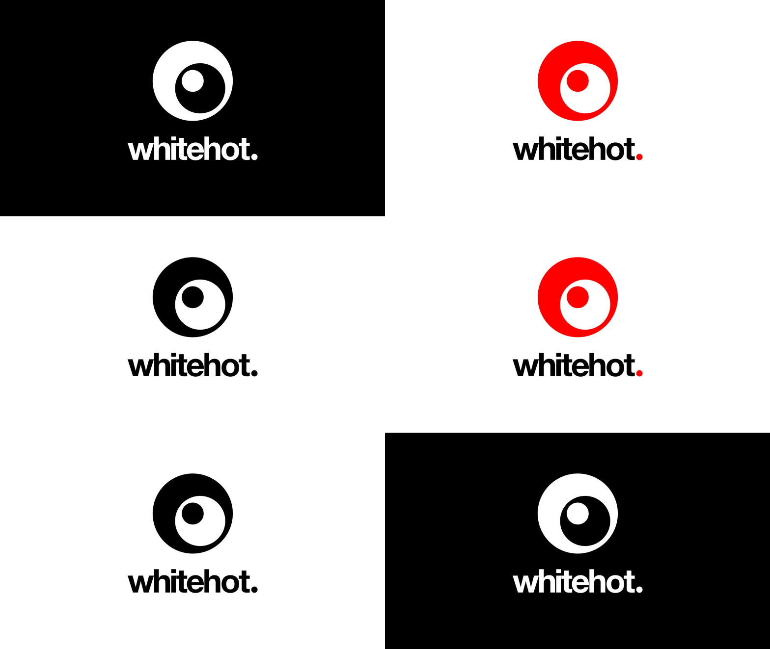
The best logos still look great when their colour is stripped away and they’re presented in black on white, white on black or any other two contrasting colours for that matter. This isn’t true of all logos whose designs may loose impact due to their reliance on overlapping transparent colours for example. Always get your designer to show you how your logo looks in black and white, it’s a great way to test the strength of your logo.
Your logo’s shape and proportion
Think about the overall proportion of your logo and where you want it to look its best, maybe that’s your website or shop signage for example. Will it be square or more rectangular in shape? Some of our clients like to have both in the form of primary and secondary logos. A square, more badge shaped version for situations where space isn’t such an issue and a horizontal version that’s more suited to things like their website’s navigation bar.
How does your logo look when it’s reduced in size?
Try to avoid a logo with too much fine detail. A heavily detailed logo might look great on a 27-inch iMac screen. But this might not hold at smaller sizes. As well as being more iconic, it’s another reason why logos with a clean uncomplicated design tend to be more successful. So always test the logo at a reduced size and consider how it’s going to look in the following situations:
- Viewed on a lower definition screen
- Featured as a small app icon
- Embroidered onto company uniforms.
- Printed on your company brochure
- Printed on branded merchandise etc.
Creating your perfect logo
We realise this is a lot to consider, but hopefully you’ll now have a much better understanding of what you want before you start your logo design process. You might have even changed your mind completely about the type of logo that’s right for your business. Either way, you’ll be in a much better position to brief your logo designer. We hope you choose us…
We’d love to work with you to create a beautiful logo, so please get in touch using the phone number, email address or enquiry form at the bottom of this page.

Need more than logo design?
As a design agency we’re also able to provide a full range of creative solutions that might be useful as your business develops. You can also see what else we get up to by taking a look at our work page.
Branding
We’ll develop a complete brand identity based around your logo including typography, colour pallet, tone of voice and imagery. All detailed in a comprehensive brand guideline document to make sure all your future marketing material remains consistent and on brand.
Graphic design
We provide an expert graphic design service that’ll bring all your branded marketing material to life. Consistently expressing the same look, feel and brand message for the following marketing collateral: Brochures, annual reports, bid documents, corporate presentations, company stationery, exhibition graphics and advertising.
Website design
Make your company’s brand stand out from the crowed online with a modern fully responsive content managed website. We provide a complete website design service including domain name management, hosting and training.
Enquire now!
If you’d like to talk about your logo, why not get in touch by completing the enquiry form.
